In this post, we will explain how Dimensional Planning can work by sharing a story of how we applied it in a project and how it helped us to steer the project towards delivering its desired outcomes in time.
The story
In 2018, we joined a project to develop a new product for one of our customers. In true agile fluency ‘optimizing’ style, the team included business, marketing, UX, product vision, and development. We had a clear goal: enter the market with this new product. We had some new insights on using dimensional planning to estimate and achieve goals.
For obvious reasons, we have to apply some discretion here. We cannot share all the project details. Instead we will add some concrete examples from the product we’re currently working on, the online Agile fluency Diagnostic application.
Let’s introduce some of the people involved (not their real names): Sarah was our ambitious business owner; Rob, Magnus, and Wilbert were the developers, Jelle was our UX designer, Diana our marketeer and Anton was our product owner.
We got involved in the project in February when some of the work had already been done. Anton, Diana, Sara and Jelle had created a user story map. And like often happens, the goals were set: launch an initial (beta) market release by June, launch a full release in September.
The estimate and dimensions
We took a week or two to get acquainted with the technology involved. But then it started to itch. We had set dates, and the ambitions were sky high, but I had this uncomfortable feeling that the plan might not be feasible.
Rather than to live with the scope and date, Magnus, Wilbert and I decided to to a quick estimation session. I wrote the stories on index cards,threw them on the table and did an initial rough relative estimate.
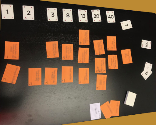
We compared a few of the stories with what we had done in the past two weeks, extrapolated the numbers and concluded: June is definitely not feasible. August is more likely. Then I proposed to add dimensions to the story. Although quite some interaction designs where already done by Jelle, I proposed to set a goal: have the functionality barely working at the end of June. We could get feedback from some beta customers and use their feedback for planning the second release.
For this company, we co-created their own version of the Dirt Road/Cobblestone Road/Highway metaphor: Paper Cup, Coffee Mug, Silver Chalice. So the exact metaphor does not matter, as long as it aids shared understanding between development, business and customers.
We split the stories in Paper Cup and Coffee Mug stories and took about half of the estimate for the Paper Cup version. This again was a very rough estimate, but it seemed like a good idea. Firstly, we thought we would see along the way how well we where doing. And secondly, we realised that we lacked knowledge, hence analysing the work in too much detail would be useless.
The first sprints
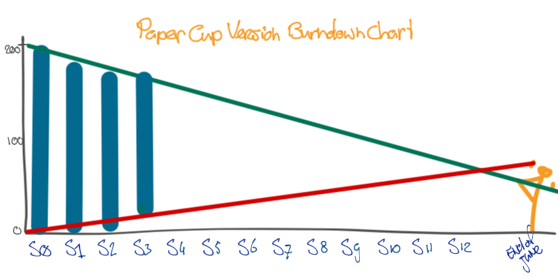
The company used Jira to keep track of stories, but we maintained a physical board as well. As I did not trust Jira to print burn downs charts correctly, I used an Excel sheet to generate the charts. The drawings in this post are based on those. Here is the first burn down chart, after three sprints:
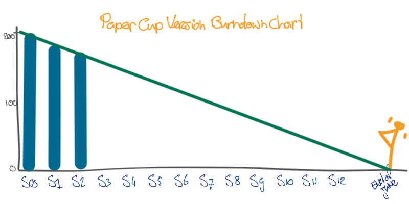
We tracked the estimated work still to be done, depicted by blue bars, and extrapolated the estimated release date from that data - the green line. Nothing fancy, that’s is what a release burn down chart should show.
The graphs looked too good to be true actually. The forecast release date was almost exactly end of June. It made me worry more than anything else. Something unexpected is always bound to happen. I’d rather see that sooner than later.
Coping with slowing down
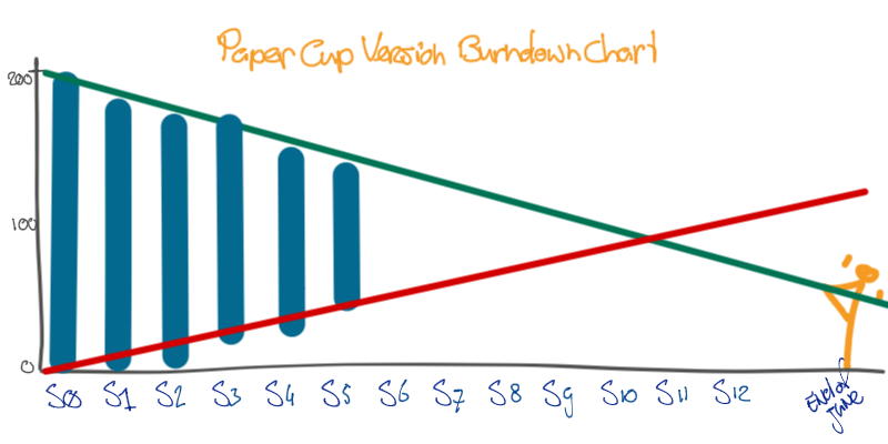
Then we started to see some slow down in our work. Some of the work took a bit more time than expected.
There are several ways of dealing with this situation. One way is to just move on and hope for the better. Another option is to assume that this was just a hiccup, and our real velocity wouldn’t change, as shown in the picture below (dark green line).
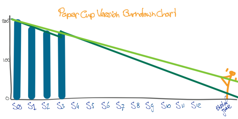
This hiccup scenario is not really honest. Extrapolating should be about taking the trend in work that is finished, or rather a progressing estimate of the work still to be done. The light green line is more honest, and in fact more pessimistic. We would be looking at the end of July rather than the end of June.
Remember the Dirt Road guiding question from our dimensional planning post:
What can we leave out?
So we started to look critically at the paper cup stories, to see what we can leave out. The backlog was sorted in order of priority, so together with Anton, we moved some lower priority paper cup stories out of scope.
It would be tempting to lower the last bar with that, and so lower the green line. However, doing so would obfuscate the decisions we just made. It would wrongly suggest we were going faster. A better option is to visualise the work removed by removing the work from the bottom of the bar. Just like the green trend line of the work being done, we now could visualize a trend line about the scope being reduced as well, as shown by the red line in the picture below.
I like to call that effect lifting the horizon. When the green line crosses the red line, we would be done with the first release.
A change of mind(-set)
You could argue that there is a limit to what you can do with reducing the scope of the project. Like the green trend being too pessimistic, the red line may be too optimistic. We were well aware of that possibility. But here’s what actually happened.
At first I still wasn’t happy with the fact that the end date was around the end of June. We didn’t seem to have any slack. It would just be a matter of time before something unexpected would happen. So in the next sprint, we would have the same discussion of leaving something out from the bottom of the paper cup backlog. The effect was something like the picture below.
I really liked the effect of reducing the scope and its visualisation. The way I had used burn down graphs before was to visualize a team’s speed towards a goal only. But now I realized that if we wanted, we could play with the end date by lifting the horizon. It became a bit of an addiction to repeatedly look at the current scope critically, and identify ways to get something valuable sooner. In that way we could postpone decisions on what value to bring next.
Fractal dimensional planning
During the project we kept looking at the scope in this way. Dimensional planning, in its original inception of the idea, talks about three dimensions:
- Dirt road (or paper cup)
- Cobblestone road (or coffee mug)
- Highway (or silver chalice)
How you project these dimensions on a software product you are developing is somewhat subjective. You can have lively discussions on product quality. What is a coffee mug to one person can be unnecessary polishing of the silver chalice to the other. For me, the silver chalice became a metaphor of something unnecessary, much like the YAGNI - You Aren’t Gonna Need It principle in eXtreme Programming.
After delivering a release, I thought of the rest of the project as a new release: a fresh start, new chances, new estimates, new end dates.
To be totally honest, the dates remained quite, eh… fixed.
Yes, the backlog was filled with everything we postponed during the former release, but in the mean time so much had happened. We had gathered feedback, we visited clients, we learned so much that we revisited the whole backlog.
And yes, we started again, with the same discussions on paper cups for now and coffee mugs for later and silver chalices for the far, far future. In this way, dimensional planning is fractal.
Summary
We have walked you through a story of using dimensional planning in practice. We have shown what we did with lifting the horizon and how that became somewhat addictive.
Visualizing the work done over time separately from the scope reduced over time really changed my thinking about burn down charts. If you want, you can play around with the horizon.
‘Resetting’ a project after a release changed my way of looking at dimensional planning as well: Dirt roads and Cobblestone roads become the interesting dimensions, while Highways are much more YAGNI - you aren’t gonna need it.
Credits: I really am not much of a writer, and ‘speeling error’ are my middle names. There is no way I could write anything really, without Willem and Marc, cleaning up the mess. Thanks guys.
This post is part of a series on Dimensional Planning:
- Dimensional Planning - good enough software, early & often
- Dimensional Planning - a story
- Dimensions of Dimensional Planning
- Dimensions of Features - an example